1. consider
The room, or outdoor environment, used to host an event is the most static aspect of the design. It's not going to change, and that 800 sq. foot space is larger than any table top decoration. I think it's so important to pick colors that will compliment the aspects you like in your space, and bring life to them.
The wedding Tessa and I are planning (for a friend of hers) is an outdoor wedding at the Oregon Coast. The coast in Oregon is a bit different than a beach - the skies are usually a bit cloudy - so, right away, we knew that the color gray should be the base for our color palette. Even if we didn't create one gray element for the big day, it would most likely be the color of our backdrop.
I think a neutral color, like gray, or brown or beige or black or navy or cream or white is a fantastic place to start. Are you working with white walls in an event center? Brown wooden beams in a lodge? A night wedding with a navy blue sky? Choosing a base color set us in motion towards choosing the right tones, and accent colors.
2. get inspired
Planning a big event is like creating a world. It’s not just on paper, it’s real – how it looks, how it smells, how it feels under your fingers – it’s is all up to you. I love décor that feels organic with the space and overall vision. It doesn't fight against the setting, it brings it to life.
With this in mind, Tessa and I set out to find complimentary colors for our coastal wedding. We thought about the bleached out color of driftwood, the silvery green of beach grass, the pearly pink insides of seashells, and golden sage brush. We pulled from every source we could think of and found a common theme in all of them: they were muted and soft.
3. listen
When Tessa and I presented our selection of subtle colors, we were surprised when our bride told us "I just want purple." Purple? It was just about the only color we hadn't considered. But, it's not about us. Our happiness depends on the couple being happy with what we create - and that means listening to them on the simple things, like color choice.
If you're planning an event for yourself, just skip this part. The only thing you need to listen to is your heart (...or maybe the groom).
4. choose
Anyone who has ever agonized over the placement of green-yellow and yellow-green when organizing a crayon box can attest that color can be confusing. Tones, shades, hues ... it's enough to give anyone a meltdown in the paint-chip isle.
That's why we're so thankful for Color Collective. It was an invaluable resource the day we came home with a handful of washed-out colors and a swatch of purple. Lauren's palettes are inspired by editorials, art, and look-books. They gave us specific breakdowns from stylish, real life applications. We printed out ten of them on card-stock, and re-paired and re-ordered continuously. After a while we thinned out the stack and found our favorites and then we looked for common elements between them.
In the end, we came to a pretty palette for our coastal wedding: white - gray - coral - turquoise - and, a perfect plum.
Choosing a Color Palette is step one in planning our first ever real-life wedding. Our previous experience consists of throwing lavish birthday parties for ourselves. If you saw the circus tent we built you'd be impressed. Follow along on this adventure!
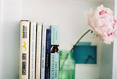
images: (1) on film with my pentax k1000 (2) color collective - palette portion by Lauren, photographs from Sander Van Den Bosch (3) pintrest, no source given. Do you know? (4) our color choices - in spools. We found that the thread rack, at the fabric store, is the perfect place to pick the official color samples. It's a little less overwhelming than the paint chips


Oooh, these colors look lovely together! I think it's a kind of unexpected combo, which makes it even better.
ReplyDeletewhat a lovely tutorial. i adore the inspiration board you have here.
ReplyDeleteI love these! So beautiful. I'm really excited about hearing all about the details of the planning!
ReplyDeleteThis is such a gorgeous palette with some great ideas.
ReplyDelete