Showing posts with label Art. Show all posts

been there | Massachusetts Museum of Contemporary Art

 It doesn't quite make sense to say that MASS MoCa was "worth the drive", since the drive itself was a work of art. We went a few weeks ago, so there was still snow on the ground and the winter sun was shining through the bare-tree trunks. The museum is housed in a converted 19th century factory and the white brick walls are basically made of windows. Between that and the polished concrete floors, I was tempted to lease it as an apartment.

The current exhibit is called Oh, Canada! and it features - you guessed it - contemporary Canadian artists. Some of it was a little heavy handed (like this pannel by John Will, featuring the names of the participating artists spray painted with the word "Nothing.")  But, a few pieces really resonated with me 

I think contemporary art has the power to be especially evocative, because it takes work to make sense of what we're seeing. When we recognize the abstract sounds and images, it's because they connect with something we know. 

Memories, because they're so deeply personal, feel unique to us. But, both of my favorite pieces pointed to the commonalities in both our present feelings and in our past. Maybe the moments I cherish most are more universal than I realize.

my two favorite works ... 
  • Sarah Anne Johnson, Fireworks: a boat bobs in the arctic, under a sky of watercolored fireworks. I loved how the color runs into the ocean, the same way that the light of a firework starts to fall and is reflected before it burns out. In the New Yorker, she says that she adds paint to photos to "...create a more honest image. To show not just what I saw but how I feel about what I saw."
  • Michael Snow, Solar Breath: an hour long video of curtains being blown against a glass-patio door. In the audio you hear catydids and the sounds of plates scraping at dinner time. It sounded like home.

other arty things...


(photos) on film with Pentax k1000 | in the last they're standing under Xu Bing's Phoenix, which you can see on the Mass MoCa Pinterest

a day at The Art Institute of Chicago.


Truthfully, I usually find museums overwhelming. I end up being both so stimulated and worried about what I'm missing, that in under an hour I'm worn out. Not the case with The Art Institute of Chicago - which is impressive, expansive and impeccably organized. I was able to spend most of my time in the Modern wing, with a shorter visit to my buddies The Impressionists (and it was easy to by-pass all the boring cultural artifacts ... which isn't very arty to say, but hey.) 

AIC holds some very famous works of art, including American Gothic and Van Gogh's Bedroom. The paintings were so familiar - having seen them in photographs, greeting cards and textbooks - that standing in front of the actual canvas felt surreal. I love being able to put my face as close to the paintings as security will allow, looking at the marks left behind by the brushes. It's incredible to imagine where the masters once stood, and as close to meeting Monet as I'll ever be. 


I also got to see the Roy Lichtenstein Retrospective that was previewing while I was there (since my date was a member). It's now open to the public and will be running through September. It's such an energetic collection! My favorite were a series of landscapes done in the style of the Song Dynasty, especially the one below, titled Treetops Through the Fog. His ability to create - with just a series of dots! - a completely clear subject with so many levels of depth is amazing. I spent a good couple of minutes in front of them, and the fields shift depending on where you focus.  Technically the landscapes are the last series in the showing, but I accidentally entered the exhibit backwards. Seeing them first reminded me to use fresh eyes and to let go of the ideas I already had about him as a comic-book inspired Pop Artist.

It was also fun to see his really iconic works like Drowning Girl, or as I like to call it Contact Photo in My Cellphone for All My Ex-Boyfriends.


(photos) all on film with my Pentax k1000 - except for the last. The corresponding AIC pages for each of the pieces can be found here : Pollock and Monet.

on Cloud Gate.


Looking at Cloud Gate in pictures, I wasn't sure if it was really my style. It seemed kind of ostentatious - tacky, even - and reminded me of the senseless modernism I associate with Jeff Koons. But, I was completely enraptured by the real thing.

The object itself bares no signature, or even marks of construction (the entire steel covering is seamless). It just is. Because of this, it doesn't seem like a large outdoor expression of a single artist, but as a piece of truly public art.  The sculpture's appearance is constantly created by the people who are viewing it, as their images are mirrored back.

The piece itself is ceaselessly changing; on a grand scale - the surface changes color with the light of day - and on a small scale, with the events occurring around it. How many works of art are actually different every time you see them? This lends it an element of interest, not just to tourists who see it once in a lifetime, but to the residents who see it everyday.

Because the surface of the sculpture is reflective, it also achieves a timeless quality that evades many public installations, that quickly appear dated. It changes with the style of architecture surrounding it, the cars, and the way people dress. The piece is literally a reflection of the current time, so in some aspects it is always contemporary.

Cloud Gate is a reflection of the world around it. Any interest, outside the engineering of the enormous object, would be lost if it wasn't for it's surroundings. To me, it seems like a love letter to the city it's placed in. Constantly reflecting back the beauty of everyday life in Chicago.


(photos) 1 and 2 - on film with Pentax k1000.  3 - on instagram. username: SamShorey
(sculpture) Cloud Gate by Anish Kapoor, located in Millennium Park in downtown Chicago, IL

bouncy balls in San Francisco


"how many times are you going to watch that video today?"
"a-hundred-and-seventy-thousand bouncy balls set to the music of Jose Gonzales is the only thing that gets me right now, okay?!"
I know it's been nearly blogged to death - but I'm going through another phase with the Sony Bravia commercial set in San Francisco.

It's like someone's heart burst open from feeling too much: silly, alive, and a little bit melancholy.

[(photos) by Peter Funch (commercial) Sony Bravia]

Weekend Reading :

t o u c h  of  c o l o r
  • Hila shared what it's like to have synesthesia - a condition where people 'see' color in words, smells, or even sounds! She describes it as "sort of like a reverse form of color blindness"
it reminds me of ....
  • John Locke's parable about the value of experience in AJ Jacob's, The Know-It All
"The blind man wants to know what the color scarlet is like, so he interviews dozens of people about the color scarlet, thinks a long time about the topic, then, at long last, he victoriously announces that he knows what scarlet is like: "It is like the sound of a trumpet." I sometimes wonder, am I the blind man?" 
  • this Lauren DiCioccio painting : a color code of the contributors page in Vogue. I'd love to hang it in my office someday.
  • the way Chris Martin describes sacrificing for the one you love as  "Yellow" in the Coldplay song.  
do you have any interesting color connections?
To me, the light in cities always seems to be a certain color.

(photos) utility ribbon art | walking I spotted a web on Burnside | Megan Geckler Through Looking Back You May Go Blind, installation at Avant LA (via Black Eiffel)

The Suspended Second


 Two-thousand dandelions picked in the country side, then hung from a ceiling by Regine Ramseier. A fitting piece to share, as we stand before a new year.

Today we draw in our breath. And, we hold it. For one suspended second.
Seeing each seed, each downy sail. Multitudes clustered together, singular but somehow whole. This second is where the magic is : peering into the possibility of what will start, in the instant we exhale.

The blown apart beginning.

ready? here it comes.
5 ... 4 ... 3 ... 2 ...


[ (photo) by Regine Ramseier via This is Colossal ]

Martin Creed | Everything is Going to be Alright

Oh, boy. The juxtaposition of Martin Creed's neon on the classical and weathered Scottish National Gallery of Modern Art really does it for me. A message like Everything is Going to be Alright, coming from a building dating to 1825, says something doesn't it?About the way we carry on - despite the challenges that seem world-ending.  A nearly identical installation is on the Museum of Contemporary Art Detroit, another unlikely location. It deepens a statement that can seem almost senselessly hopeful.

I also appreciate the technicals of the photo itself, by the unmatched Brian Ferry. I know if I shot this on a hazy gray day I would have over exposed it (like always) and lost the texture of the mossy cracks and the vibrance in the neon light.

Contrast is vital to depth - in a photo, and in art.

(photo) Brian Ferry of The Scottish Gallery of Modern Art and Martin Creeds no. 289 
(p.s) another neon message from Robert Montgomery

Robert Montgomery Installation | The People You Love


 Robert Montgomery classifies his installations as "recycled sunlight", a combination of solar cells and neon. It adds another layer of depth to an already poetic statement.

The people we love are like this ... like a message lit up by sunlight that was caputred before the dark came. In absence we don't just carry their memory. We carry the very real glow of the life we shared - brilliant and bright enough to become alight even though they're gone.

[ (1) Robert Montgomery  (p.s.)  neon installation at the Detroit Contemporary Museum | & the influential Nathan Coley ]

Product Packaging | New or Old?

Companies spend millions of dollars a year on product redesign. The grocery store aisles are full of "extreme", "sport", and "new and improved" packages.  But, it's all lost on me.

That doesn't mean I'm not a sucker for marketing. I just go for the classics. You can always find the Coppertone girl in my cart, right next to Pepsi Throwback.

I get a certain kind of comfort using the same things from my childhood in the kitchen and at craft table. 
(me, sentimental? never!)

Do you have a favorite classic package?
Morton's Salt and Clabber Girl are two of my favs. 

Or are you a modern girl? 
I'm crazy about the label design for the beers at Goose Island Brewery, especially Matilda and Lolita.

  [ (1, 2) on film with my Pentax k1000. I should start a mess-making portfolio. I could go pro!
(p.s.) Another super cute label photo : House Wine. Wouldn't it make a cute housewarming gift?]

Jackie in the Old Photographs

"It's only on the incandescent Jackie in the old photographs (and particulary in the photograpshs where she's standing next to some poor frump) that they excite desire. They repel desire, too. The "armorial" smoothness of her hair and clothes telegraphs a message of defiance:

'Nothing can ruffle me.' " 
Judith Thurman, Costume of the Country.
Cleopatra's Nose: 39 Varieties of Desire (p. 383)

[ photos of Jacqueline Kennedy's trip to India, March 1962. By Art Rickerby for Time & Life. Getty Images

Rodarte at MOCA "States of Matter"


June 5th will be the last day of the Rodarte exhibit, States of Matter, at Museum of Contemporary Art. It features the costumes Kate and Laura Mulleavy designed for the film Black Swan, as well as complimentary looks from their previous collections. Seeing the exhibit was a highlight of my recent trip to Los Angeles and I urge everyone to visit before it's gone!

In the world of academia, fashion takes a beating. Critics see it as fickle consumerism. Feminists call it a tool of oppression and a mindless distraction. But, this installation transcended the realm of rolling-racks and showed fashion as Art.

The exhibit begins with a set of dimly lit black garments from the Spring 2010 runway show. The collection was inspired by the California condor. (Have you ever seen one of those? They're like pterodactyl cross-bred with a vulture, yikes.)
The dresses are made of multiple layers of crochet and matte-black fabric. They are multidimensional with out being dense, much like birds wings.  Duality is central to a lot of Rodarte's collections, and I think the S2010 collection is really demonstrative of the relationship the Mulleavys create between the ugly and the beautiful .  

The center flock is offset by glittering black tutus, strung from the ceiling. The stiff and corset like construction of the bodices means that they hold a human form as they turn in place. They look as if they are inhabited by an invisible, sinister ballerina.

The second floor begins with pieces from the following season, Fall 2010. It features long white dresses, detailed with Chantilly lace and intricate ruffles. The whole look is hyper-feminine, almost to the point of parody. It reminded me a lot about the way Natalie Portman's character, Nina, in Black Swan is coddled by her mother. Nina, though in her twenties, still lives in a room decorated for a child. Her mother brushes her hair and calls her "my sweet girl".  Ballet has always praised youth and traditional femininity. A dancer's body lacks femme-fatal curves, and instead is delicate and ageless. Nina, like many ballerinas, has conditioned herself to repress all appetites - for food, for sex, or indulgence. These ideals are reflected in the long white dresses, which are reminiscent of brides and nightgowns. There is an air of virginity in every soft breath of tulle.


The final installation features the tutu from the climatic scene of the movie; an ice-white and feathered masterpeice stained by a swatch of blood. It is accompanied with two looks from Rodarte's Fall 2008 collection. On the runway, both the dresses and the tights appeared to be made out of stretched gauze. In person, it is gruesome and beautiful dip-dye. Red wicks up the white, like blood stains. 


This was my favorite part of the exhibit, and the details were breath taking. On one of the dresses, a nude mesh along the side joined the two halves of draped white with a zipper. The zipper was surrounded by a collection of deep red, sanguine, and marigold rinestones. When the wearer undresses it will look as if her skin is tearing open.

This exhibit is a perfect example of the way that fashion serves as a system of signs. The pieces were created to tell a story. They translate an idea. The Mulleavy sisters design clothes that are eerie and sweet, organic and ethereal, simply beautiful and full of meaning.  


(photos) 1. on film, with my Pentax k1000 outside MOCA's Pacific Design Center | 2, 3. Rodarte Spring 2011 on style.com | 4. Autumn de Wilde | 5. crochet work from Vogue Italia via fashion lover | 6, 7. Autumn de Wilde | 8, 9, 10. Rodarte Fall 2010 on style.com | 11. Black Swan film still | 12. Rodarte Fall 2008 on style.com | 13. style.com, Rodarte's Night At the Museum | 14.  kleider sachen 

view Autumn de Wilde's full set of photo's for MOCA here and watch the video narrated by Kate and Laura themselves. Haunting visuals, explained so much better than I can.

been there | Urban Light at LACMA

Urban Light, Lacma
Urban Light, Lacma
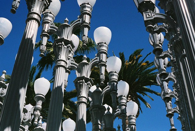
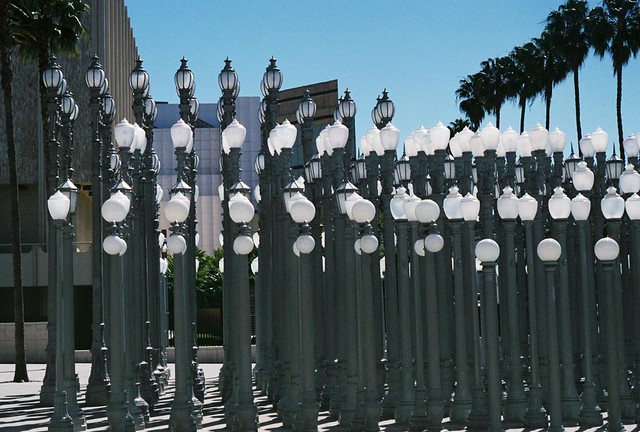
One of my close friends from college interns at the Los Angeles County Museum of Art. Can you believe this is where he goes to work everyday? The entrance features the installation Urban Light by Chris Burden, which is made up of two-hundred and two vintage street lights from around the city.

Of course I brought my camera along, like a true tourist. But, for him it was just another day at the office.


(photos) Urban Light at LACMA. On film with pentax k1000. These photos are the first time I've ever been brave enough to shoot at a shutterspeed of 1/1000th of a second. So crisp, so much contrast! (p.s) More at Urban Light on my flickr

been there | Bottega Louie

Bottega Louie, macaron heaven
Bottega Louie for Breakfast
There are lots of not-so-fun things about being an adult: paying the electric bill. Washing the duvet cover. Trying to put the duvet cover back on your comforter and feeling like you are defying some fundamental law of physics (ugh.).

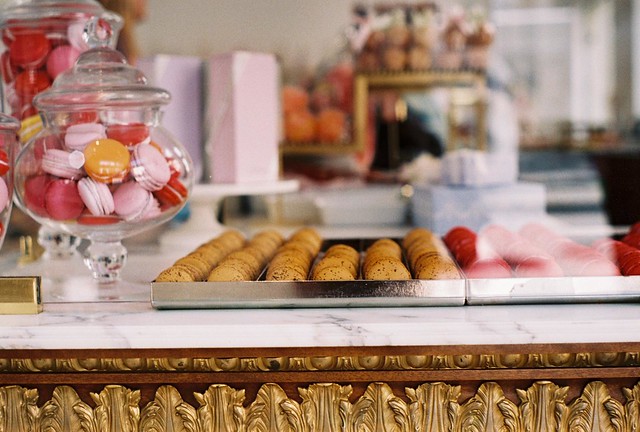
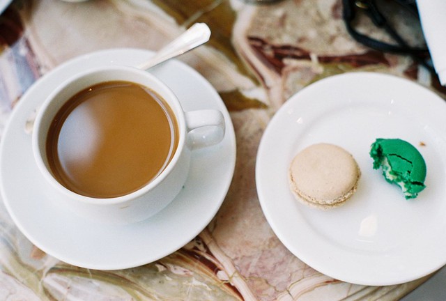
But, being an adult and being on vacation  ... now that is fun. While I was in Los Angeles, my friend Christopher took me to Bottega Louie. I had a cup of coffee and two french macarons. I had cookies for breakfast, just because I could.

What's your favorite thing about being a grown up?

(1 and 2) Pentax k1000 on 400iso film, shot at 100iso. More at Bottega Louie on my flickr

PBRidiculously Cute

I woke up this morning, did the obligatory purse check to make sure that another miracle had occurred and I didn't lose my cellphone or wallet, and found 18 Pabst coasters in there.

Alcohol has the ability to make everything in my already overly-emotive world even more deserving of emphasis so ... when I spotted these at the bar it went something like this:

"oh my gosh look how CUTE these BABY ELEPHANTS drinking PABST ARE!!!! Look at that LITTLE GUY just putting his little truck in there, using his elephant hand to brace himself!!! Or that LITTLE BABY so CUTE just sitting on top of there chatting with his baby elephant pal!!!!"

Apparently, Pabst's guerilla art campaign is working out for both of us. Free art and creativity for them from little known artists ... free coasters and cuteness for me.

(1) eugene duane's 'Pink Elephants Go Home

Installation Art : Wind Beneath My Wings


.
I saw this gorgeous installation, called flight response, at Erica Tanov in Berkeley.

I think it's made of vintage magazine advertisements. Something about their color and placement evoke the feeling the I often get when I see bird flocks; that they're having so much fun.

I can't stop wondering if Susie Grant would install one of these in my studio apartment


Assurance in Neon

Work N. 790 by conceptual artist, Martin Creed. Installed at the Museum of Contemporary Art, in Detroit. I love the almost senseless optimism. Rational or not, it still shines.

Don't Believe the Hype


(images) Terry Richardson

"Never read what people write about you. Just measure it in inches" Andy Warhol

Portland Polaroid

Loving this polaroid by Cori Kindred today, taken at Portland's St. Johns Bridge.

I feel so lucky to live here lately {despite the fog and cold} because the more I look around the more I realize how many inspired people live here.

If there is one thing that I hope travels by osmosis it's creativity. You can be inspired too: just add {rain} water

Acronophobia*

*Acronophobia (n): An abnormal and persistent fear of heights. Sufferers experience severe anxiety even though they realize as a rule that heights pose no real threat to them.


When it's slow on Sunday's at work I get to read the New York Times at the host-stand. I don't think this is generally allowed but my managers realized that I get antsy and walk around if I have nothing to do, so they went for the lesser of two evils considering I will read the paper cover to cover and stay put. I saw these photos on a backpage advertising The New York Times store and even though it is a 2-dimensional image I still got that momentary tightening in my stomach when i looked at them {like I felt when I visited the Empire State Building and stayed plastered to the wall}. Funny the way a photo, even when it's flat and no bigger than my hand, can elicit a response so real.

I guess when they say "It feels like you're there!" that includes feelings of imminent peril and nausea.

Pantone's Color of the Year: Turquoise

I've been really in love with turquoise for a while: from my typewriter to the turquoise trim & dishes in my mexi-kitchen! So when Pantone named it their 2010 color of the year, I said tah-tah mimosa (last year's color) and smiled smugly at my Pantone-premonition.

They described the color as
"a protective talisman, a color of deep compassion and healing, and a color of faith and truth, inspired by water and sky. Through years of color word-association studies, we also find that Turquoise represents an escape to many"
and after 2009, couldn't we all use a little vacation?


(1) Idee Multicolr Search Lab - just select your colors from the right hand menu and get a fabulous flickr collage!
(2) A truly turquoise color swatch from Pantone
(3) Splatter paint shopping by color at Etsy
(4) Turquoise typography at I Can Read

(5) A pretty & perky print
(6) Runway ready at Zac Posen via The Cut

and if you can't get enough there is always ...
{there is a blog for everything!}

p.s. if you think this doesn't effect you, you can't forget THIS scene from The Devil Wears Prada, about Pantone's color of the millennium: Cerulean.

ashore All rights reserved © Blog Milk Powered by Blogger